Heatmap
The Heatmap control helps users visualize tabular data using a color surface.
To Add a Heatmap Control:
-
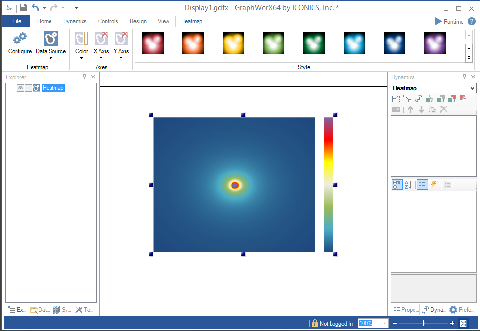
Open GraphWorX64, then click on the Controls ribbon and then on the Heatmap control. The cursor will turn into a crosshairs "+", which will allow you to draw the size of the Heatmap control you would like in the center display portion of the GraphWorX64 configuration window. Simultaneously, the GraphWorX64 ribbon will change to allow modification to the Heatmap settings.
Heatmap Control Added to GraphWorX64 Configuration
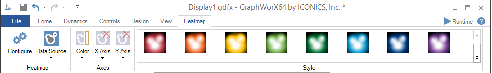
Heatmap Ribbon Controls
Heatmap Ribbon
Heatmap
-
Configure - Clicking this button opens the separate Configuration window, allowing you to change the settings for the currently selected Heatmap control.
-
Data Source - Clicking this button opens the separate Data Browser window, allowing you to navigate to your selected data source for the Heatmap control. Clicking the downward facing caret
 beneath the
button allows you to select a data source individually for the X Binding,
Y Binding, Value Binding or Type Binding.
beneath the
button allows you to select a data source individually for the X Binding,
Y Binding, Value Binding or Type Binding.
Axes
-
Color - Click this button to modify the visibility and location of the color axis. You can select from None, Top, Left, Right, or Bottom.
-
X Axis - Click this button to modify the visibility and location of the X axis. You can select from None, Top, or Bottom.
-
Y Axis - Click this button to modify the visibility and location of the Y axis. You can select from None, Left, or Right.
Style
The Style section
of the Heatmap ribbon allows you to select a pre-set colored Heatmap combination
for your selected control. Click the button to cycle
through provided options row by row within the Style section of the ribbon
or click on the  button to view all of the options.
-
Click on the Configure button or double-click directly on the Heatmap control. This brings up the Confirmation window, shown below.
Configuration Window
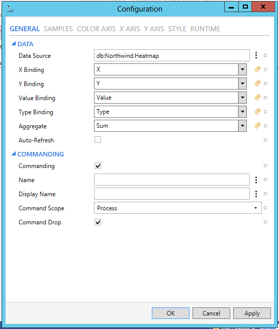
GENERAL
Configuration Window - GENERAL Tab
HEATMAP
-
Data Source - Data source for the heat map. Can be any data set with at least three columns: X and Y position and value. Enter a data source for the Heatmap control in the text entry field or click on the
 button to open the Data
Browser and navigate to your preferred data source. You can also click
on the
button to open the Data
Browser and navigate to your preferred data source. You can also click
on the  button to reset the current setting.
 -
Reference - Reference data source name for retrieving dataset columns. See Reference Propertyfor more info.
-
X Binding - Defines data binding for X axis. Enter an X Binding in the text entry field or use the pulldown menu to select from any recently provided setting or click on the
 button to open the Data Browser and navigate to your preferred data
for the X Binding setting. You can also click on the button to reset the current
setting.
button to open the Data Browser and navigate to your preferred data
for the X Binding setting. You can also click on the button to reset the current
setting. -
Y Binding - Defines data binding for Y axis. Enter an Y Binding in the text entry field or use the pulldown menu to select from any recently provided setting or click on the
button to open the Data Browser and navigate to your preferred data
for the Y Binding setting. You can also click on the button to reset the current
setting. -
Value Binding - Defines data binding for sample value. Enter a Value Binding in the text entry field or use the pulldown menu to select from any recently provided setting or click on the
button to open
the Data Browser and navigate to your preferred data for the Value
Binding setting. You can also click on the button
to reset the current setting. -
Type Binding - Defines data binding for sample type. Enter a Type Binding in the text entry field or use the pulldown menu to select from any recently provided setting or click on the
button to open
the Data Browser and navigate to your preferred data for the Type
Binding setting. You can also click on the button
to reset the current setting. -
Aggregate - Function used to calculate sample value. Enter an Aggregate in the text entry field or use the pulldown menu to select from Sum, Avg, WAvg, Min, Max, or Count. You can also click on the
button to open the Data Browser and navigate to your preferred data
for the Aggregate setting. You can also click on the button to reset the current
setting. -
Auto-Refresh - Automatic data refresh initiated by the data source. Click this checkbox to automatically refresh data provided to the Heatmap control. You can also click on the
button to reset the current setting.
DATA
-
Use Default Refresh Rate - Use default refresh rate or refresh rate inherited from parent container.
-
Refresh Rate - Data refresh rate of data sources defined for properties, in milliseconds. Do not modify if you intend to use local variables for sharing data with other controls, e.g. selected asset or current time range.
COMMANDING
The Heatmap is one of many controls that now supports executing commands on events. These events vary per control, but, for the Heatmap, they include:
• Ready
• Started
To configure the command to be executed when this event occurs, go to Runtime tab. Find the Commands on Events section, check Enable Commands on Events, then configure the form below.
See Platform Services > Commanding > New: Execute Commands on Events for more details.
-
Commanding - Determines whether commands are enabled for this display. Use the CommandingName setting to specify a registration name. Click this checkbox if you intend to use Commanding with the current Heatmap control. You can also click on the
button to reset the current
setting. -
Name - Name used for registering the control for commanding. Enter a name in the text entry field to associate the current Heatmap control with any command(s). You can also click on the
button
to reset the current setting. -
Display Name - User friendly control name. Enter the name (in the text entry field) to appear in the display, associated with the current Heatmap control and any command(s). You can also click on the
button to reset the current setting. -
Command Scope - Indicates whether commands sent and received by this display affect the current process only (Process) or all processes that are currently opened (Machine). For inter-process commanding, use the Machine option. Use the pulldown menu to select from either Machine or Process. You can also click on the
button to reset the current setting. -
Command Drop - True to enable receiving commands by drag and drop. Click this checkbox in order to allow for Drag and Drop of commands in association with the current Heatmap control. You can also click on the
button to reset the current
setting.
SAMPLES
Configuration Window - SAMPLES Tab
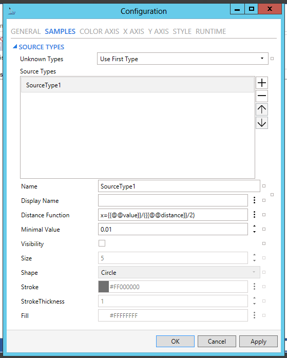
SOURCE TYPES
-
Unknown Types - Defines how to process samples with unknown source type names. Use the pulldown menu to select from 'Use First Type' or 'Drop Samples'. You can also click on the
button to reset the current setting. -
Source Types - Collection of source types. First type definition is the default definition. Click on the plus button [+] to add a source type. Click on the minus button [-] to remove a selected source type. Click on the up/down buttons to move a selected source type within the list. You can also click on the
button to
reset the current setting. -
Name - Name and unique identification of this type. This name must be equal to the name from the data source column Type (see the Type Binding configuration). Enter a name in the text entry field. You can also click on the
button to
reset the current setting. -
Display Name - Display name of this type visible to users. Enter a name in the text entry field or click on the
button to open the Data Browser and navigate to your selected display
name. You can also click on the button to reset
the current setting. -
Distance Function - Distance function used to calculate values around the sample. Use {{@@value}} and {{@@distance}} placeholders for value and distance variables, for example x = {{@@value}}/{{@@distance}}. Function must return values from [Minimal Value, 1]. Enter a distance function in the text entry field or click on the
button to open the Data Browser to navigate to your source for a distance
function. You can also click on the button to
reset the current setting. -
Minimal Value - Optional minimal value from interval [0,1]. It is recommended to set a non-zero to improve performance. Enter a minimal value in the text entry field or use the up/down buttons. You can also click on the
button to reset the current setting. [Note:
Minimal Value defines the diameter of the sample "stamp".
In case of weighted average, the stamps must overlap to get a reasonable
result. Zero Minimal Value ensures an expected result, but yields
the worst performance. For a "Full" data set, it might be
enough to pick the maximum distance to neighbor samples, i.e. the
value of the distance function for: 1/max(w,h), where w, h is the
width and height of the smallest rectangle defined by four samples.
For sparse data, you should set it to zero to be safe.] -
Visibility - Sets the visibility of sample markers. Click the checkbox to make the sample markers visible. You can also click on the
button to reset the current
setting. -
Empty Values - Visibility of sample markers with empty values.
-
Size - Radius of sample markers. Enter a size in the text entry field or use the up/down buttons. You can also click on the
button to reset the current setting. -
Shape - Shape type of sample markers. Use the pulldown menu to select from Circle or Square. You can also click on the
button to reset the current setting. -
Stroke - Stroke brush of sample markers. Enter a hex color code in the text entry field or click on the
button to open the Brush Picker window to set/select your preferred
color. You can also click on the button to reset
the current setting. -
StrokeThickness - Stroke thickness of sample markers. Enter a stroke thickness in the text entry field or use the up/down buttons. You can also click on the
button to reset the current setting. -
Fill - Fill brush of sample markers. Enter a hex color code in the text entry field or click on the
button to open the Brush Picker window to set/select your preferred
color. You can also click on the button to reset
the current setting.
Note that there is an additional
button to the furthest right within the SOURCE TYPES
tab, between the Name and Display Name settings. This allows you to Reset values to default settings
or set Default source type collection
(Single source type with value inversely proportional to distance).
COLOR AXIS
Configuration Window - COLOR AXIS Tab
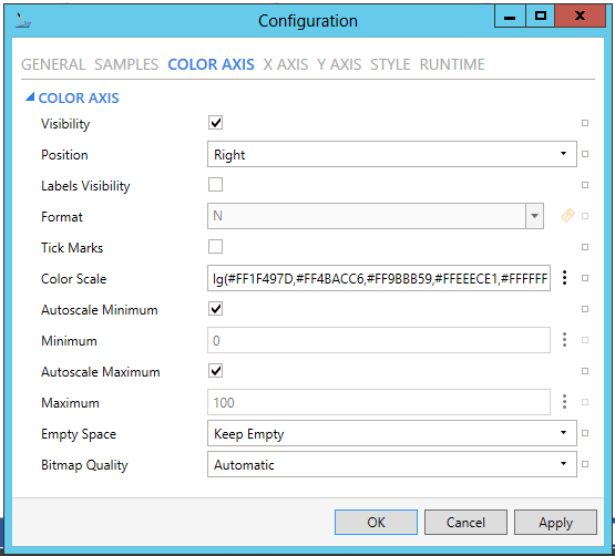
COLOR AXIS
-
Visibility - Color axis visibility. Click the checkbox to make the color axis visible. You can also click on the
button to reset
the current setting. -
Position - Color axis position relative to the control. Use the pulldown menu to select from Left, Top, Right, or Bottom. You can also click on the
button to reset the current setting. -
Labels Visibility - Color axis labels visibility. Click the checkbox to make the color axis labels visible. You can also click on the
button to reset the current setting. -
Format - Numeric format of values on color axis. Enter a format in the text entry field or use the pulldown menu to select from C, D, E, F, G, N, P, X, 0.0, 0.00, or 0.000. You can also click on the
button to open the Data
Browser to navigate to your preferred format. You can also click on
the button to reset the current setting. -
Tick Marks - Color axis tick marks visibility. Click the checkbox to make the color axis tick marks visible. You can also click on the
button to reset the current setting. -
Color Scale - Color/value scale used for visualization of samples. Enter the hex color codes in the text entry field or click on the
button to open the Data Browser to navigate
to your preferred color scale. You can also click on the button to reset the current
setting. -
Autoscale Minimum - Color axis automatically adjusts the scale to fit actual minimum value. Click the checkbox to enable this option. You can also click on the
button to reset the current setting. -
Minimum - Color axis minimum value. Enter a minimum value in the text entry field or click on the
button
to open the Data Browser in order to navigate to your selected minimum.
You can also click on the
button to reset the current setting. -
Autoscale Maximum - Color axis automatically adjusts the scale to fit actual maximum value. Click the checkbox to enable this option. You can also click on the
button to reset the current setting. -
Maximum - Color axis maximum value. Enter a maximum value in the text entry field or click on the
button to open the Data Browser in order to navigate to your selected
maximum. You can also click on the button to reset
the current setting. -
Empty Space - Defines visualization of empty space between samples. Use the pulldown menu to select from Keep Empty or Use Minimum Value. You can also click on the
button to reset the current setting. -
Bitmap Quality - Defines the ratio between quality and performance of data visualization. Use the pulldown menu to select from Automatic, VeryHigh, High, Medium, Low, or VeryLow. You can also click on the
button to
reset the current setting. -
Smooth Transitions - Enables smooth visual transitions on data changes.
X AXIS
Configuration Window - X AXIS Tab
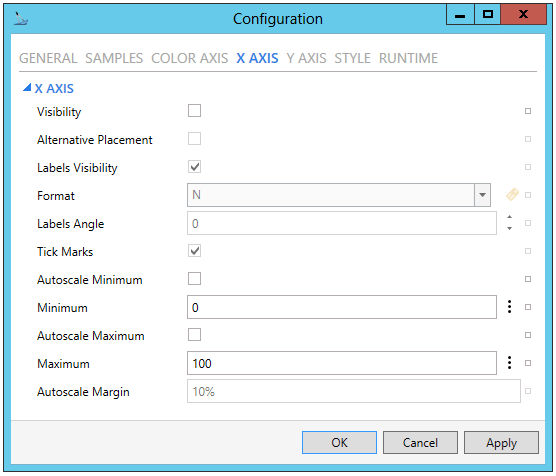
X AXIS
-
Visibility - X Axis visibility. Click the checkbox to make the X axis visible. You can also click on the
button to reset the current setting. -
Alternative Placement - Show X axis on top side. Click the checkbox to show the X axis on the top side of the control. You can also click on the
button to reset the current
setting. -
Labels Visibility - X axis labels visibility. Click the checkbox to make the X axis labels visible. You can also click on the
button
to reset the current setting. -
Format - Numeric format of values on X axis. Enter a format in the text entry field or use the pulldown menu to select from C, D, E, F, G, N, P, X, 0.0, 0.00, or 0.000. You can also click on the
button to open the Data Browser and navigate to your selected format.
You can also click on the
button to reset the current setting. -
Labels Angle - Rotation of labels on X axis. Enter a degree of rotation in the text entry field or use the up/down arrows. You can also click on the
button to reset the current setting. -
Tick Marks - X axis tick marks visibility. Click on the checkbox to make X axis tick marks visible. You can also click on the
button to reset the current setting. -
Autoscale Minimum - X axis automatically adjusts its range to fit actual minimum value. Click the checkbox to enable this option. You can also click on the
button to reset the current setting. -
Minimum - X axis minimum value. Enter a minimum value in the text entry field or click on the
button to open the Data Browser
in order to navigate to your selected minimum. You can also click
on the button to reset the current setting. -
Autoscale Maximum - X axis automatically adjusts its range to fit actual maximum value. Click the checkbox to enable this option. You can also click on the
button to reset the current setting. -
Maximum - X axis maximum value. Enter a maximum value in the text entry field or click on the
button to open the Data Browser
in order to navigate to your selected maximum. You can also click
on the button to reset the current setting. -
Autoscale Margin - Adds a margin defined as percent or as absolute value when calculating automatic range on X axis. You can also click on the
button to reset the current
setting.
Y AXIS
Configuration Window - Y AXIS Tab
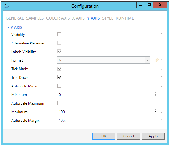
Y AXIS
-
Visibility - Y Axis visibility. Click the checkbox to make the Y axis visible. You can also click on the
button to reset the current setting. -
Alternative Placement - Show Y axis on right side. Click the checkbox to show the Y axis on the right side of the control. You can also click on the
button to reset the current
setting. -
Labels Visibility - Y axis labels visibility. Click the checkbox to make the Y axis labels visible. You can also click on the
button
to reset the current setting. -
Format - Numeric format of values on Y axis. Enter a format in the text entry field or use the pulldown menu to select from C, D, E, F, G, N, P, X, 0.0, 0.00, or 0.000. You can also click on the
button to open the Data Browser and navigate to your selected format.
You can also click on the
button to reset the current setting. -
Tick Marks - Y axis tick marks visibility. Click on the checkbox to make Y axis tick marks visible. You can also click on the
button to reset the current setting. -
Top-Down - Y axis values increase from top to bottom. Click the checkbox to enable this option. You can also click on the
button to reset the current setting. -
Autoscale Minimum - Y axis automatically adjusts its range to fit actual minimum value. Click the checkbox to enable this option. You can also click on the
button to reset the current setting. -
Minimum - Y axis minimum value. Enter a minimum value in the text entry field or click on the
button to open the Data Browser
in order to navigate to your selected minimum. You can also click
on the button to reset the current setting. -
Autoscale Maximum - Y axis automatically adjusts its range to fit actual maximum value. Click the checkbox to enable this option. You can also click on the
button to reset the current setting. -
Maximum - Y axis maximum value. Enter a maximum value in the text entry field or click on the
button to open the Data Browser
in order to navigate to your selected maximum. You can also click
on the button to reset the current setting. -
Autoscale Margin - Adds a margin defined as percent or as absolute value when calculating automatic range on Y axis. You can also click on the
button to reset the current
setting.
STYLE
Configuration Window - STYLE Tab
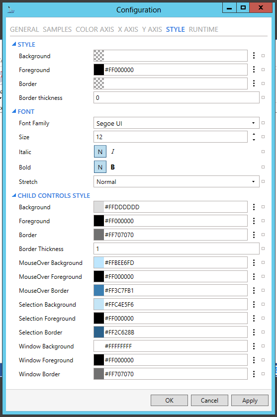
STYLE
-
Background - Background color, gradient or pattern of this object. Enter a hex color code in the text entry field or click on the
button to open the Brush Picker window and select your preferred Background.
You can also click on the
button to reset the current setting. -
Foreground - Foreground color, gradient or pattern of this object. Enter a hex color code in the text entry field or click on the
button to open the Brush Picker window and select your preferred Foreground.
You can also click on the
button to reset the current setting. -
Border - Color, gradient or pattern of the border surrounding this object. Enter a hex color code in the text entry field or click on the
button to open the Brush Picker window and select your preferred Border.
You can also click on the
button to reset the current setting. -
Border thickness - Width of the border surrounding this object. Enter a border thickness in the text entry field. You can also click on the
button to reset the current setting.
FONT
-
Font Family - Specifies the name of the font used to render text. Use the pulldown menu to select your preferred font. You can also click on the
button to
reset the current setting. -
Size - Specifies the size of the font used to render text. Enter a font size in the text entry field or use the up/down arrows. You can also click on the
button to
reset the current setting. -
Italic - Specifies the style of the font used to render text (italic). Click on either the N or I button to select your preferred style. You can also click on the
button to reset the current
setting. -
Bold - Specifies the thickness of the font used to render text (bold). Click on either the N or B buttons to select your preferred font thickness. You can also click on the
button to reset the current setting. -
Stretch - Specifies whether a font appears with a typical width (Normal), narrower than usual (Condensed), or wider than usual (Expanded). Use the pulldown menu to select from Normal, Condensed, or Expanded. You can also click on the
button to reset the current setting.
CHILD CONTROLS STYLE
-
Background - Background brush of child controls. Enter a hex color code in the text entry field or click on the
button to open
the Brush Picker window and select your preferred Background. You
can also click on the
button to reset the current setting. -
Foreground - Foreground brush of child controls. Enter a hex color code in the text entry field or click on the
button to open
the Brush Picker window and select your preferred Foreground. You
can also click on the
button to reset the current setting. -
Border - Border brush of child controls. Enter a hex color code in the text entry field or click on the
button to open the Brush Picker window and select your preferred Border.
You can also click on the
button to reset the current setting. -
Border Thickness - Border thickness of child controls. Enter a border thickness in the text entry field. You can also click on the
button to reset the current setting. -
MouseOver Background - Background brush of child controls under mouse cursor. Enter a hex color code in the text entry field or click on the
button to open the Brush Picker window and
select your preferred background brush of child controls under mouse
cursor. You can also click on the button to reset
the current setting. -
MouseOver Foreground - Foreground brush of child controls under mouse cursor. Enter a hex color code in the text entry field or click on the
button to open the Brush Picker window and
select your preferred foreground brush of child controls under mouse
cursor. You can also click on the button to reset
the current setting. -
MouseOver Border - Border brush of child controls under mouse cursor. Enter a hex color code in the text entry field or click on the
button to open the Brush Picker window and select your preferred border
brush of child controls under mouse cursor. You can also click on
the button to reset the current setting. -
Selection Background - Background brush of selected child controls. Enter a hex color code in the text entry field or click on the
button to open the Brush
Picker window and select your preferred background brush of selected
child controls. You can also click on the button
to reset the current setting. -
Selection Foreground - Foreground brush of selected child controls. Enter a hex color code in the text entry field or click on the
button to open the Brush
Picker window and select your preferred foreground brush of selected
child controls. You can also click on the button
to reset the current setting. -
Selection Border - Border brush of selected child controls. Enter a hex color code in the text entry field or click on the
button to open the Brush Picker window and select your preferred border
brush of selected child controls. You can also click on the button to reset the current
setting. -
Window Background - Background brush of child control windows. Enter a hex color code in the text entry field or click on the
button to open the Brush
Picker window and select your preferred background brush of child
control windows. You can also click on the button
to reset the current setting. -
Window Foreground - Foreground brush of child control windows. Enter a hex color code in the text entry field or click on the
button to open the Brush
Picker window and select your preferred foreground brush of child
control windows. You can also click on the button
to reset the current setting. -
Window Border - Border brush of child control windows. Enter a hex color code in the text entry field or click on the
button to open the Brush Picker window and select your preferred border
brush of child control windows. You can also click on the button to reset the current
setting.
RUNTIME
Configuration Window - RUNTIME Tab
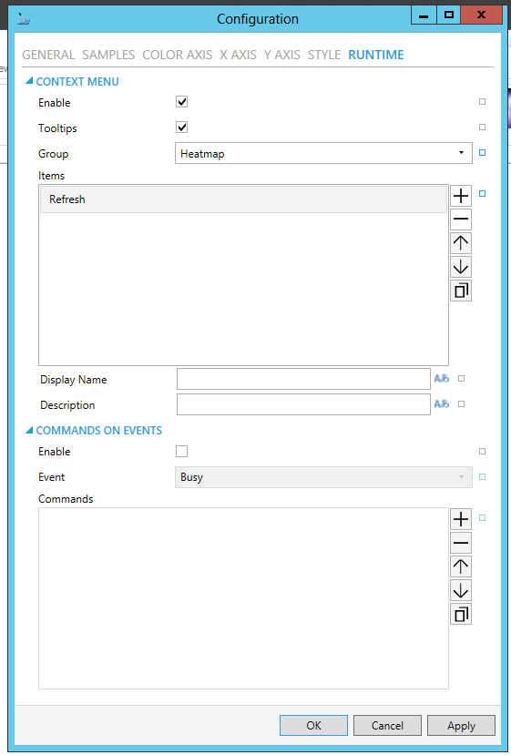
CONTEXT MENU
-
Enable - True to enable context menu on right click.
-
Tooltips - Enables tooltips on hover in context menu items.
-
Invalid Menu Items - Display mode for context menu items that are invalid (e.g. no command target).
-
Group - Select context menu group for editing. Use the pulldown menu to select from Table Control or Table Row.
-
Items - Allows users to add items to a collection based on the selected Context Menu Group. Click on the plus sign [+] to add an item to the list. Click on the minus sign [-] to remove a listed item. Click on the up arrow to move a selected item higher in the list. Click on the down arrow to move a selected item lower in the list. Click on the
 button to
duplicate a selected entry in the list.
button to
duplicate a selected entry in the list.
Heatmap
-
Refresh - Action to refresh this item.
-
Separator - Horizontal separator to separate groups of context menu items.
-
Custom Command - Custom command that can be configured to run any command with custom parameters.
-
Command - Use the pulldown menu to select the Command you wish to include as a Context Menu Item. See Commanding in GraphWorX64 for more info.
-
Display Name - Set the name displayed in configuration collection. Enter a Display Name in the text entry field. Click on the
 button
to open the Data Browser to set any required Language Alias. You can
also click on the button
to reset the current setting.
button
to open the Data Browser to set any required Language Alias. You can
also click on the button
to reset the current setting. -
Description - Set the description displayed in tooltip in configuration collection. Enter a Description in the text entry field. Click on the
button to open the Data
Browser to set any required Language Alias. You can also click on
the button to reset the current setting.
COMMANDS ON EVENTS
The Heatmap is one of many controls that now supports executing commands on events. These events vary per control, but for the Heatmap they include:
-
Busy
-
Ready
-
Started
To configure the command to be executed when this event occurs, go to Runtime tab. Find the Commands on Events section, check Enable Commands on Events, then configure the form below.
-
Enable - True to enable configuring actions and commands for control events.
-
Event - Select a control event and configure actions to fire when the event occurs. Use the pulldown menu to select from Asset Clicked, Asset Selected, Ready, or Started.
-
Commands - List of actions to perform when selected control event occurs. Click on the plus sign [+] to add an item to the list. Click on the minus sign [-] to remove a listed item. Click on the up arrow to move a selected item higher in the list. Click on the down arrow to move a selected item lower in the list. Click on the
button to duplicate a selected
entry in the list. For any Custom Command selected in the list, you
can then select a specific Command and then complete the associated
properties for that command. See Commanding
in GraphWorX64 for more info.
-
Click on theApplybutton to save your recently made settings. ClickOKto close the Configuration window and return to GraphWorX64 display configuration.
See Also: